Brand creation: from concept to visual identity guide

.avif)
.avif)
.avif)
.avif)
From concept to final brand guidelines: behind the scenes of brand creation
It often starts with a few words on a blank page: "we want an image that is bold, elegant, and reassuring." Yet, there is a gap between these abstract intentions and a ready-to-use visual identity that only a rigorous design method can bridge.
Designing a brand is not about a sudden flash of inspiration. It is a process of creative engineering where every typographic, chromatic, or spatial choice serves a specific purpose. Let’s explore the behind-the-scenes of this transformation, from the initial intuition to the final deliverable.
Immersion and framing: translating words into emotions
Before opening any design software, the work of art direction begins with listening.
- The strategic brief: This stage breaks down the value proposition, target audience, industry codes, and company ambitions. What is the tone? What promise should be conveyed at first glance?
- The moodboard: To avoid misunderstandings over subjective terms, we create a moodboard. It brings together textures, light contrasts, artistic references, and material combinations. It serves as the visual contract that validates the project's emotional direction.
Creative exploration: from sketch to system
Once the direction is set, the formal research phase can begin.
Drawing and iteration
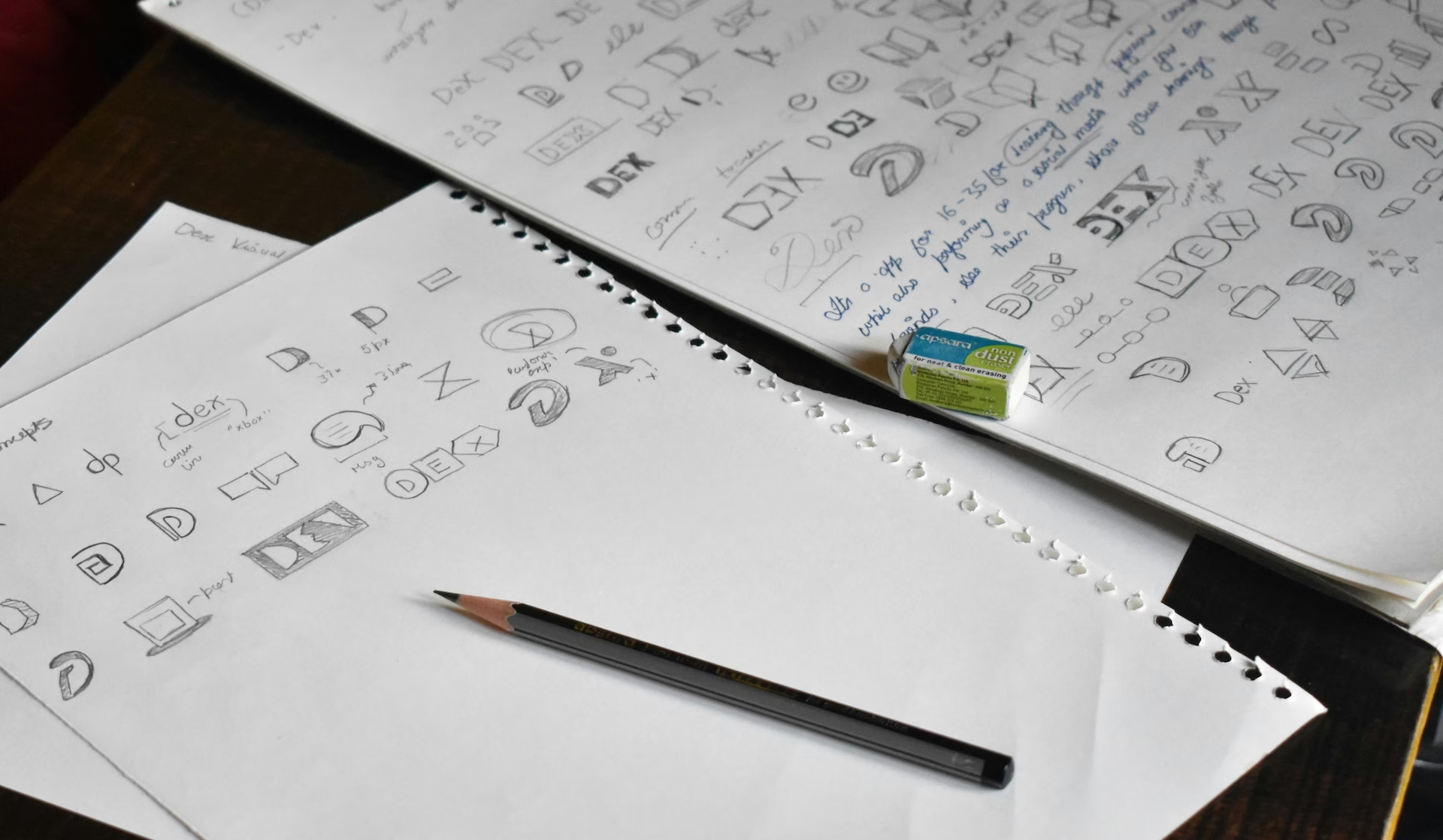
Using quick sketches, the designer explores a multitude of paths to test balance, monograms, or symmetry. The goal is to move past the obvious to find a unique perspective.
Stress-testing the concepts
An idea that looks great on screen can quickly fall apart in real-world conditions. Selected concepts are immediately projected onto concrete mockups: a business card with embossing, letterhead, packaging, or a large-format event banner. The identity must prove its legibility and impact at every scale.
Technical formalization: building the brand guidelines
This is the moment when artistic creation becomes a reliable industrial tool. The brand guidelines set out all the rules for preserving brand integrity, regardless of the service providers or media used.
This reference document structures the following fundamental elements:
- The logo and its variations: primary versions, compact formats, standalone emblems, as well as clear space requirements and minimum legible sizes.
- The standardized color palette: exact values in Pantone and CMYK for print, complemented by RGB and HEX codes for digital use.
- The typographic protocol: selection of fonts for headings, labels, and body text, along with their leading and weight specifications.
- Composition principles: layout grids, margin management, white space balance, and iconographic or photographic style.
- The materials specifications: paper recommendations (weights, textured or raw finishes) and finishing touches (foil stamping, varnish, die-cutting).
Deployment: bringing your brand identity to life
A brand guide is not a static document meant to gather dust in a drawer; it is the score your company plays every single day.
In print, choosing a premium paper with a felt-like texture and the precise alignment of text blocks turns a simple quote or sales brochure into a tangible proof of excellence. Your visual identity stops being just an idea: it becomes a cohesive and memorable brand experience.
Do you have a vision to bring to life or a legacy brand to realign with your current ambitions?
Contact the art directors at Afalence to discuss your goals and create a visual identity built to last.

See also our other articles
Discutons de vos besoins
Vous cherchez une agence de confiance pour votre projet ? Contactez-nous et découvrez comment nous pouvons vous aider