The anatomy of a successful visual identity: why it’s about more than just a logo

.avif)
.avif)
.avif)
.avif)
The anatomy of a successful visual identity: why it’s more than just a logo
"We just need a logo, quickly." This is arguably the most common phrase heard during project scoping or the launch of a new offer. Yet, hoping to carry a company's positioning solely through a logo is like buying a button to design a full suit.
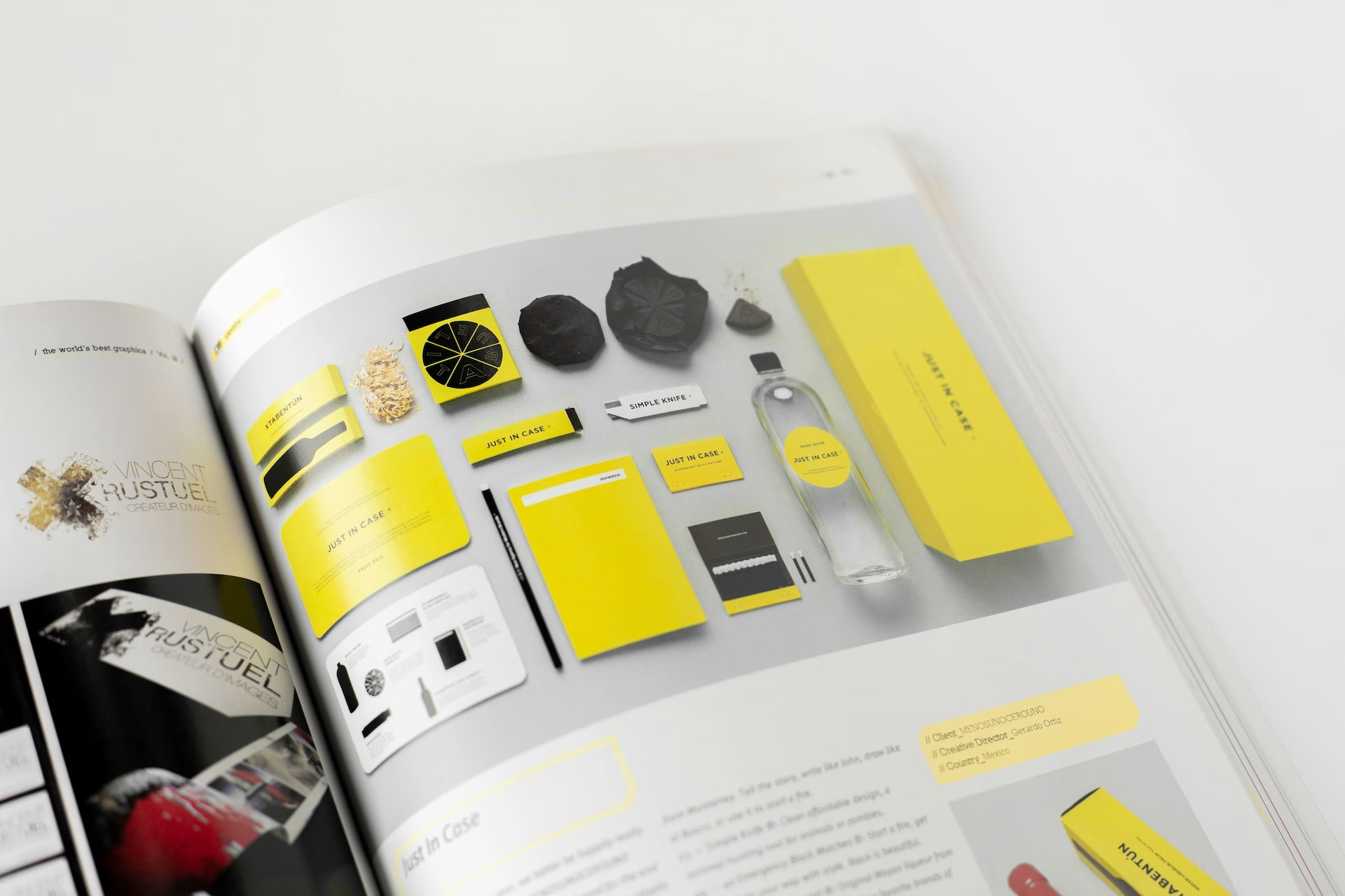
Design is not just a superficial aesthetic layer: it is the primary driver of your credibility and the silent foundation of your conversions. A true visual identity does not stop at a graphic signature placed mechanically in the corner of a page or on an email header. It orchestrates a complete, coherent, and memorable sensory universe, capable of inspiring trust before the prospect even reads a single word.
Logo vs. visual identity: understanding the fundamental difference
The logo is an essential anchor point, but without a structured universe to support it, it remains silent. Branding forges a brand's personality, values, and strategic stance; the logo, meanwhile, is merely its minimal graphic synthesis. A strong visual identity is instantly recognizable, even when its emblem is absent. Think of the signature turquoise blue of Tiffany & Co., the navy blue stripes of Jean Paul Gaultier, or the ribbon stitched on an orange background by Hermès: these markers immediately trigger emotion, recognition, and a promise of excellence.
To unleash its full power, a complete visual identity relies on a rigorous alchemy of complementary pillars:
The color palette: evoking emotion and guiding the eye
Color is the first stimulus perceived by the human brain. It dictates the emotional atmosphere in a fraction of a second and directs attention. Much like Oatly, which disrupted the muted codes of the plant-based aisle with bold, confident hues, a well-thought-out color range prioritizes information: dominant shades to set the scene, secondary shades to add nuance, and accent colors to drive action.
The typographic system: giving your message a distinct voice
Typography gives physical form to the tone of your message. A classic serif (serif) inspires tradition, intellectual authority, and refinement, while a clean sans-serif (sans-serif) evokes technical innovation, modernity, and accessibility. Defining proprietary or complementary fonts ensures fluid reading while reinforcing the identity of your communications.
The photographic and iconographic territory: embodying authenticity
Image treatment cannot be improvised. Framing, contrast management, color grading, and grain define the perceived proximity to your audience. Whether through documentary-style photo reports or a custom set of icons, this visual vocabulary anchors your values and avoids the trap of generic stock imagery.
Composition and white space: elevating information hierarchy
Layout structures the reading experience. White space is never wasted space: it is a bold editorial choice that provides clarity, prevents cognitive overload, and often conveys the natural confidence of high-end brands.
Brand guidelines: the technical guarantee of a lasting visual identity
Imagining a beautiful world is not enough: without a standardized framework, a visual identity degrades over time through various collaborations, media, and internal adaptations. The brand guidelines – or the design system – act as the methodological guardian of your consistency. They provide a compass for creative and technical teams to maintain flawless harmony over the years.
Rules for logo usage and protection
To preserve its visual impact, the logo must adhere to strict placement rules: clear space (the vital area where no other element may encroach), minimum sizes for legibility, monochrome or reversed versions depending on the background, and a list of prohibitions (distortions, added effects, rotations).
Technical specifications for print and digital
A color designed for a screen does not react the same way in print. The guidelines record the exact colorimetric matches to avoid any drift: RGB profiles and HEX codes for digital interfaces, CMYK references, and Pantone shades for physical media. They also specify manufacturing recommendations: paper choices (coated, laid, textured recycled) and high-end finishes (embossing, hot foil stamping, spot UV).

Why investing in a complete visual identity transforms your business
Viewing visual identity as a mere cost center is a strategic error. It is a direct growth lever and an accelerator of perceived value.
Reducing purchase barriers and justifying a premium position
In saturated markets where technical offerings are similar, visual perception makes the difference. A controlled and polished visual world immediately reassures the prospect, lends credibility to your pricing, and eliminates any doubts about your professionalism from the outset.
Building lasting brand equity and capitalizing for the long term
Changing your identity every two years due to a lack of method is costly in terms of time and deployment budget. A rigorously designed visual identity transcends trends, adapts effortlessly to new formats (social media, video, packaging, applications), and capitalizes on every touchpoint to firmly anchor your brand in the public's mind.
Does your brand image reflect the level of excellence of your services? The team atAfalence is here to support you in the design or redesign of your brand identity. Contact our art directors today to schedule a comprehensive audit of your visual identity.

See also our other articles
Discutons de vos besoins
Vous cherchez une agence de confiance pour votre projet ? Contactez-nous et découvrez comment nous pouvons vous aider