Webflow Tutorial: Add a Dark Theme

.avif)
.avif)
.avif)
.avif)
Dark Mode, or dark theme, is a popular feature on modern websites and applications. Most web browsers now offer the option to select your preferred display mode.
This helps, for example, to save battery life or make reading more comfortable.
To cater to your users' preferences, the presence of both Dark Mode and Light Mode on your Webflow site can help you stand out from your competitors and provide a more user-friendly browsing experience!
This tutorial guides you step-by-step to set up Dark Mode on your Webflow project.
I. Create a Button
To give the user the choice to display the light or dark version of your site, you must first provide a display modification tool.
This button can take any form you choose, depending on your site's aesthetic. Generally, the display mode selection button is often found at the top of the page.
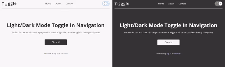
Toggle is a website template offered by Adrian Raath whose sole function is to provide a button for changing a page's viewing mode from day to night or vice versa.
In this article, we will use this template to illustrate our tutorial.
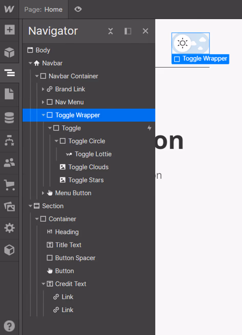
On Toggle, you'll find the button structure which contains a clickable "Toggle" element on the site. The "Toggle Circle" element corresponds to the circle inside the switch. The "Toggle Clouds" and "Toggle Stars" images are decorative background elements.
II. Defining an Interaction
A. Creating the Interaction
Once your button is created, you need to make it functional!
To do this, we will add a Webflow interaction to it.
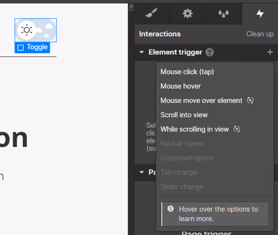
Select your new button, then go to the Interactions tab.
Add a new interaction by clicking on “+” then select “Mouse click (tap)” so that your button's interaction is triggered by a click.
B. Create Dark Mode / Dark Theme
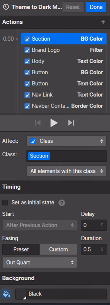
Your animation trigger is now configured. It's time to create the action caused by this button.
Select each element that needs to change color in dark mode.
Once these elements are selected, add an action by clicking on the “+” then choose the property to modify.
In the example shown, the background color is defined by the section's color. We therefore modify the “BG color” (Background color) and choose the new color “Black”.
The process must be repeated for each element to be modified.
For animation, you can choose to trigger the change of all these elements simultaneously and set a transition duration of 0.5 seconds to ensure a smooth effect.
C. Create Light Mode
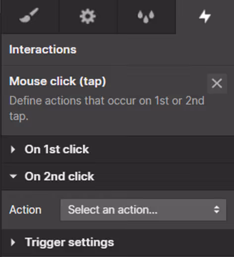
To return to light mode, add an interaction on a second click of your button.
To do this, create an action in the 'On 2nd click' section.
Then repeat the same steps as in the previous step, this time selecting the light colors!
You can now customize the button that changes the displayed version, and your 'Dark Mode' feature is set up!
III. Tips for Retrieving User Preferences
Following the method outlined previously, your site defaults to its default version regardless of your users' preferences.
To change the version directly without the user having to switch versions, you need to add a custom code snippet.
To check the user's preference, we use the function "@media (prefers-color-scheme : dark )".
We replace dark with light to select light mode.
You can then modify your CSS classes based on the result. The example below includes a "theme-a" with a white background. After reading and identifying the user's preference, the "theme-a" class adapts accordingly to become black if their choice is dark mode.
IV. Conclusion
You now know how to give your users the ability to switch your site to dark mode !
This widespread feature offers more comfort to your users and thereby enhancing the ergonomics and user experience (UX) of your Webflow project.
If you would like assistance with creating a dark mode on your site, contact us so we can discuss your project together!
For more Webflow tips, we invite you to check out our Webflow tutorials!

See also our other articles
Let's discuss your needs
Are you looking for a web agency for your project? Contact us and find out how we can help you.