The message conveyed by each color in a logo

.avif)
.avif)
.avif)
.avif)
Are you looking to choose the right colors to create your logo and brand image, or better understand the message conveyed by the logos you see every day?
You've come to the right place!
In this article, we will present everything you need to know about colors in logos.
This will give you all the tools you need to choose the colors for your logo… or to deeply understand the logos of other brands.

I. General Information on the Meaning of Colors in Logos
The color or colors of your logo have a significant impact on the emotions and values it conveys.
It is essential to dedicate the necessary time and care to color selection before creating a logo, in order to perfectly align with the brand image you wish to represent.
Before we detail the values and emotions embodied by each color, it's important to review some other fundamental elements in logo creation and perception.
1. What brand image and values should be conveyed through the logo's color?
Choosing colors for a logo comes with many other decisions.
Deciding to work on an emblem or a monogram are two very different things, for example. If you want to learn more about logo types, check out our article on logo creation.
Colors convey values and emotions. It's therefore essential to consider how to design a logo whose shape and design align with the chosen colors. This helps to best define the brand image you want to project.
Consider the following questions:
More youthful, or mature? More luxurious, or economical?
More classic, or modern? More technological, or natural?
More serious, or entertaining? More calm, or dynamic?

2. Color perception across cultures
Colors have different meanings across cultures, and the same applies to logos!
For example, in the West, the color red represents energy, passion, emotions, anger, and dynamism. Conversely, in many Asian cultures, red symbolizes longevity, prosperity, luck, luxury, and prestige.
Therefore, you need to tailor the color choice of your logo to your target audience and communicate with them effectively.
In this article, we will discuss colors through the lens of Western associations. The majority of the most prestigious companies use these color signals. There are two main reasons for this:
- Western countries were the first to have highly dynamic economies in history
- For a long time, populations in Western countries had the highest purchasing power
3. Other essential information about logo colors
By convention, black is considered a color in its own right in logo design and understanding.
Furthermore, it is highly recommended to limit yourself to a maximum of 3 colors when designing a logo. This prevents diluting your message and makes it much easier to adapt. A logo with fewer colors is also much more impactful.
We also recommend conducting thorough market research to get an excellent overview of your competitors' color identity. This will allow you to align with them or effectively differentiate yourself.
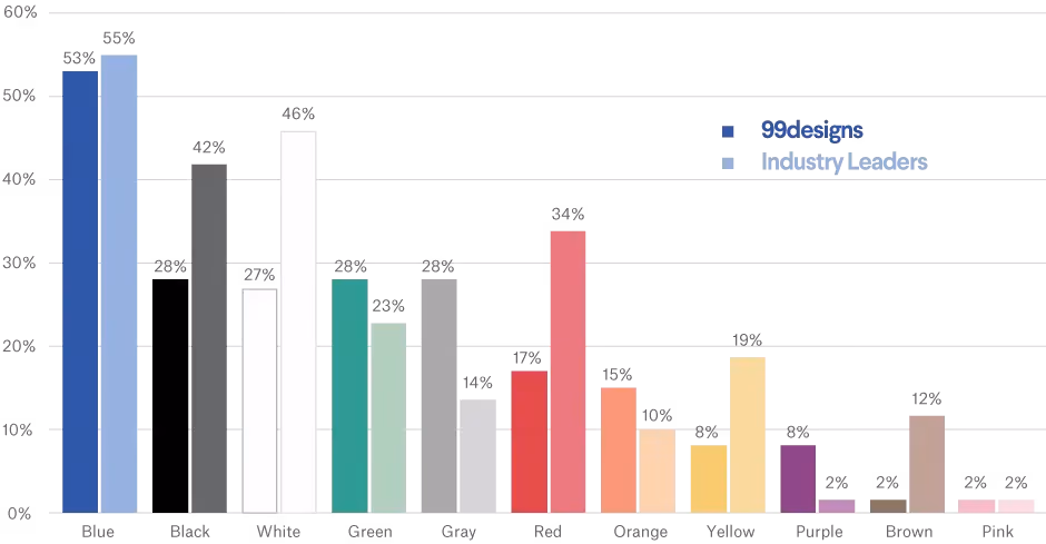
Finally, below you will find a graph where each color has two columns:
- The right column indicates the percentage of companies that use it in their logo among 527 very large companies.
- The left column indicates the percentage of people who wish to use this color in their logo, based on tens of thousands of respondents.
II. What is the meaning of each color in a logo? Which companies use each color?

Blue is by far the most used color for logos. Blue is a color that inspires trust and appeals to the widest range of people. Blue logos exude a professional atmosphere and embody progress.
It is therefore a safe bet, a reliable and proven choice. However, it is a color that is more difficult to combine effectively and will not make you stand out.
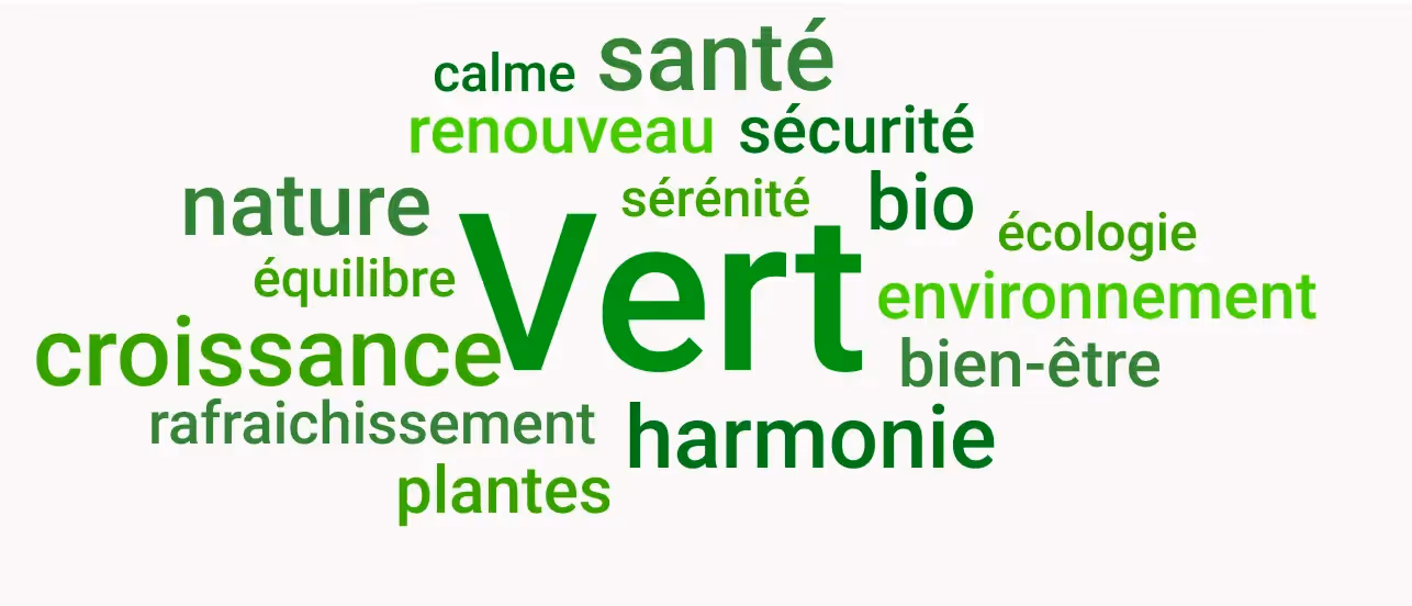
Green primarily evokes health, nature, and harmony. Consequently, many food companies use it. Starbucks, for instance, has changed its logo over the years to reduce the amount of black and increase the amount of green.
McDonald's also made an interesting change a few years ago: its secondary color shifted from the iconic red to a matte, dark, and inviting green. This illustrated their desire to strongly differentiate themselves from other "fast food" establishments, which are often red.
Furthermore, some other players wish to leverage the values of growth and balance that green conveys to stand out from their competitors. Examples include Acer, PMU, Crédit Agricole, BNP Paribas, WhatsApp...
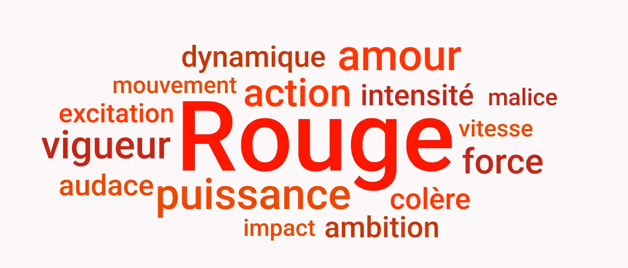
Red is a vibrant and popular color. It's associated with action and adds life and dynamism to logos. It's also a powerful, eye-catching color. Red is by far one of the most aggressive and attractive colors.
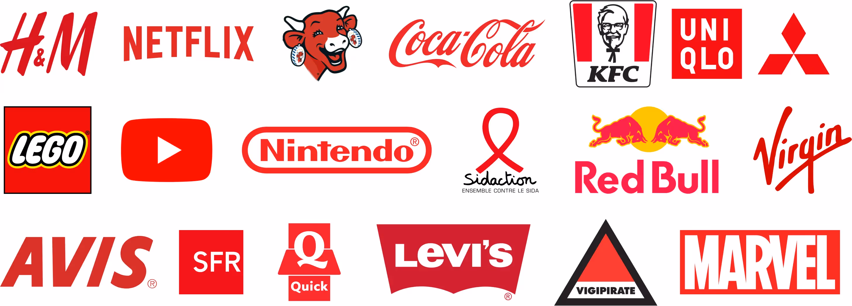
Many companies in entertainment (Netflix, Marvel, YouTube, Lego, Nintendo…), food (Quick, Coca-Cola, Red Bull, KFC…), and ready-to-wear fashion use red (H&M, Levi’s, Supreme, Tommy Hilfiger…). This color encourages spontaneous purchases or interaction.
However, be careful, red can send too strong signals or be off-putting : such a strong color can also evoke strong reactions or impressions.
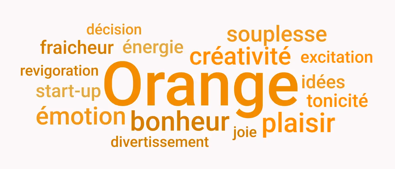
Orange is a soft and reassuring color that contrasts with red: stripped of its aggressiveness, orange is less impactful and has less authority, but gains in emotion, creativity, and joy.
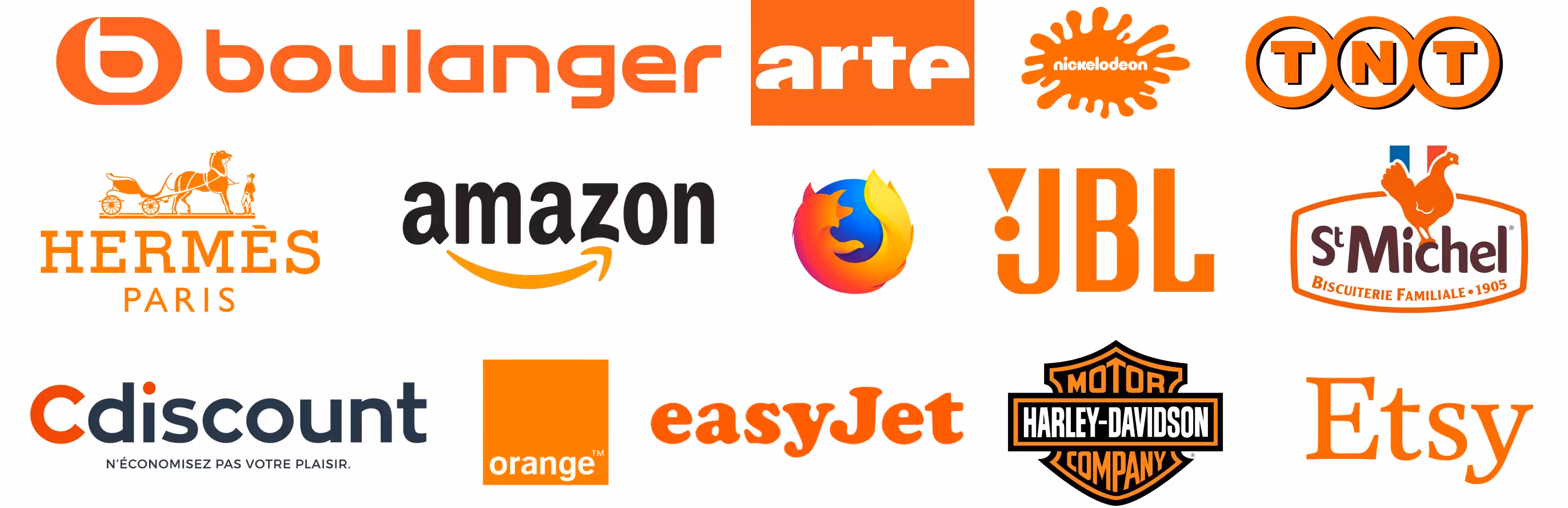
Orange is widely used by startups and companies whose activities are related to pleasure and entertainment (Arte, JBL, Nickelodeon, EasyJet, Amazon…). However, orange can sometimes give the impression of offering low-cost products or services, an observation frequently associated with light colors.
Hermès is a company that has perfectly disrupted its sector thanks to its color, as it is one of the most elegant, modern, admired, and respected luxury players.
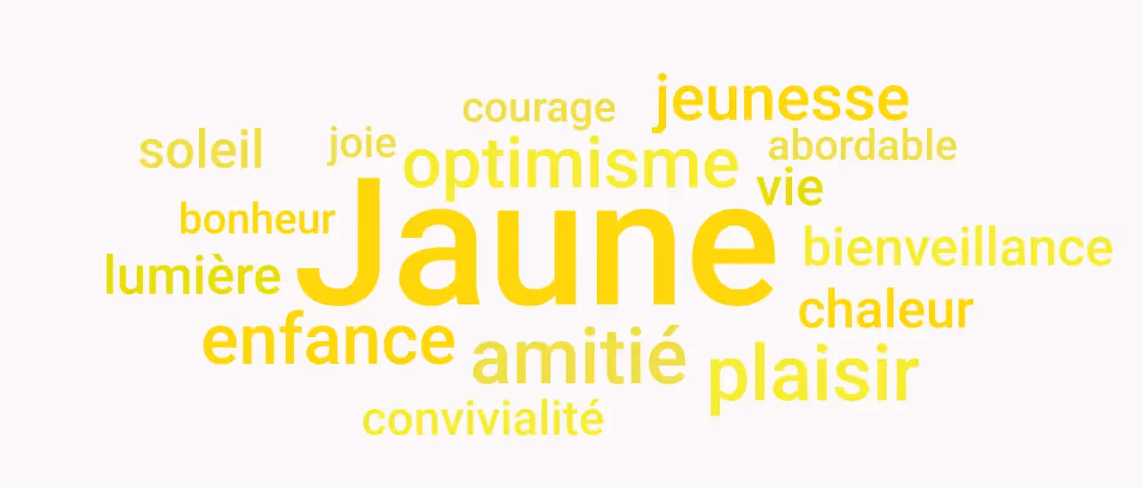
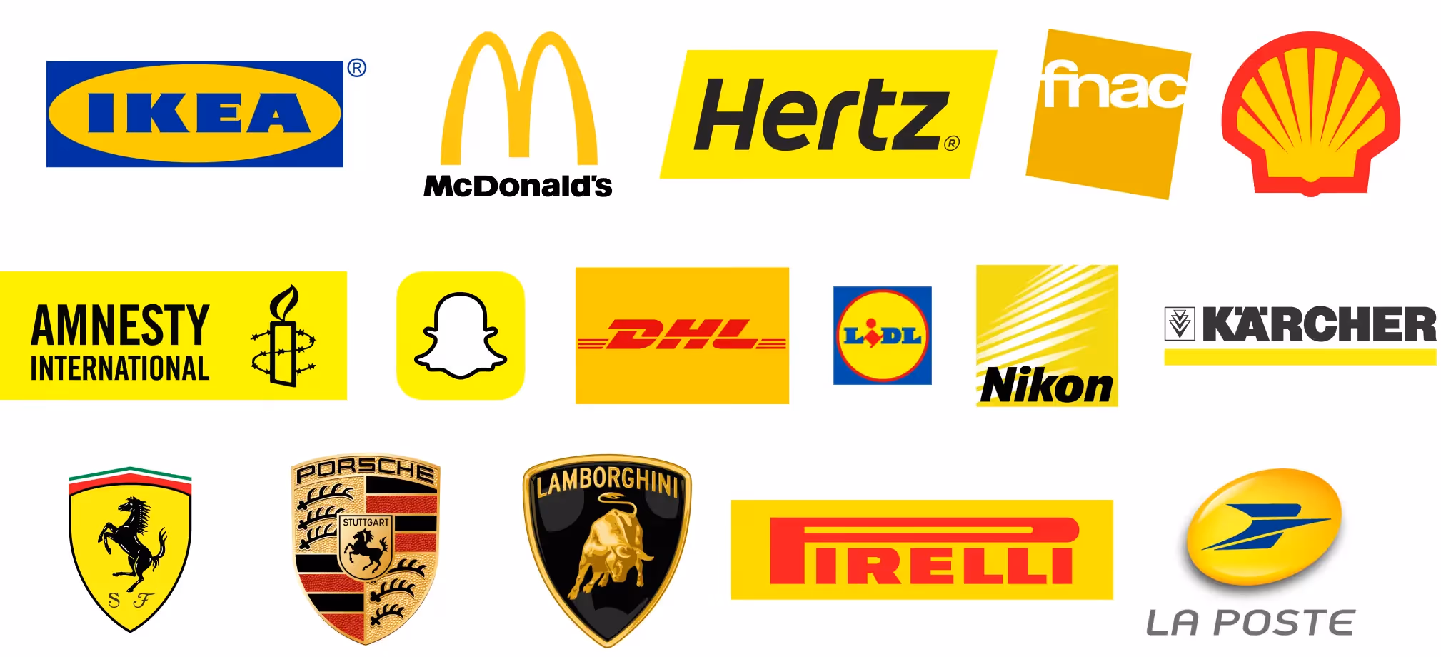
Yellow is the brightest and warmest color, associated with the Sun. It evokes youth, optimism, and friendship. It is therefore used by companies that want to unite such as McDonalds, Ikea, Lidl, and Fnac.
Gold is a derivative of yellow that evokes gold. Some luxury brands therefore like to use this color, particularly in the automotive sector.
As we mentioned above, be careful with your use of light colors, which are often associated with very accessible products or services.
This is one of the reasons why companies often associate yellow with another color that is more reassuring or engaging, such as blue or red.
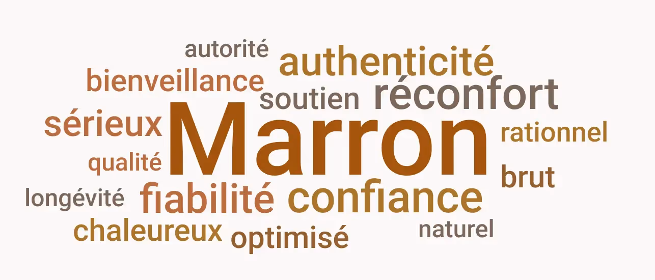
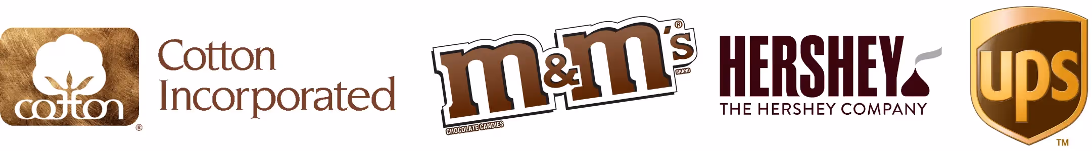
Although brown is associated with many very positive values such as authenticity, reliability, and optimization, this color is one of the least used as a primary color for logos and brand guidelines.
This is primarily due to the fact that it is a neutral color. This means that this color is very often used as a secondary color, to support or complement one or more other colors.
This is also due to the fact that this color is one of the dullest. It therefore stands out much less and is generally less visible.
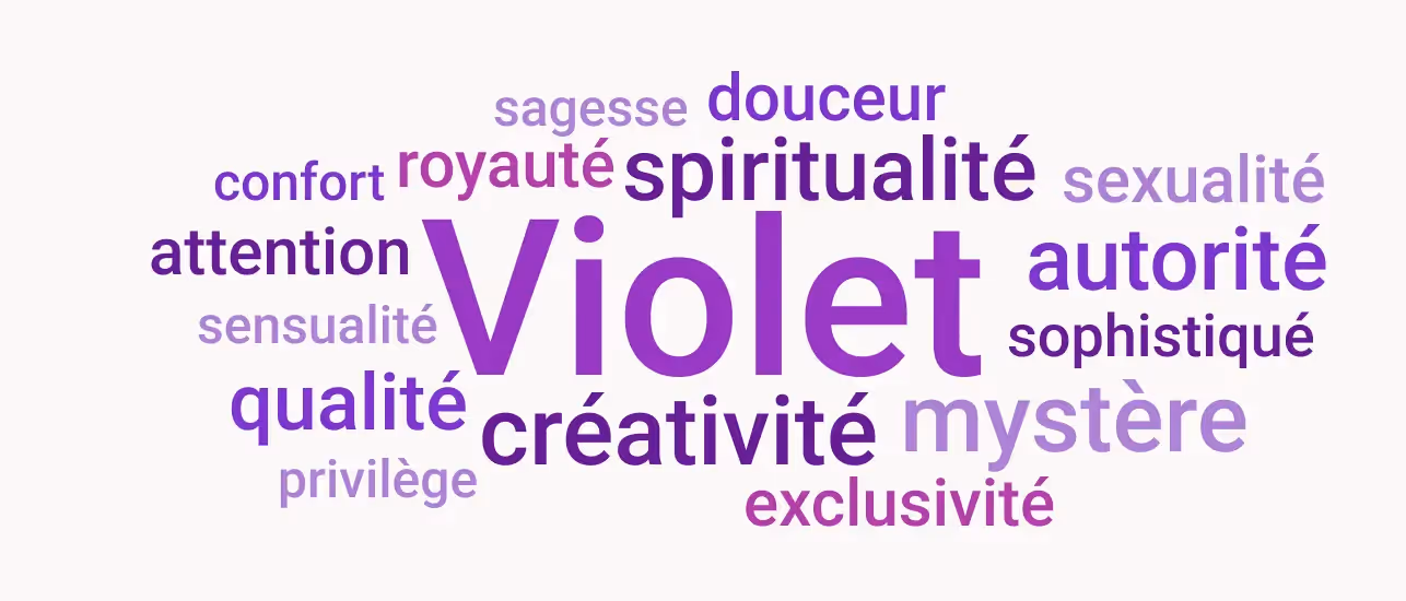
Purple is associated with softness, quality, and exclusivity. It is therefore a color perfectly suited for high-end brands or those specializing in special touches and privileged moments
[SEG 6]
.
As this color is relatively underused and halfway between blue and red, it is also an
excellent choice for differentiation , as proven by Bein Sports and Webflow.
However, be careful,
the quality of the service or product offered must be impeccable when using purple ! It is the quintessential color of refinement.

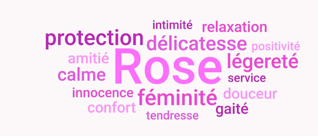
Pink is a lighter version of purple. It embodies tenderness and softness, replacing exclusivity and privilege with more
of cheerfulness, accessibility, and positivity.
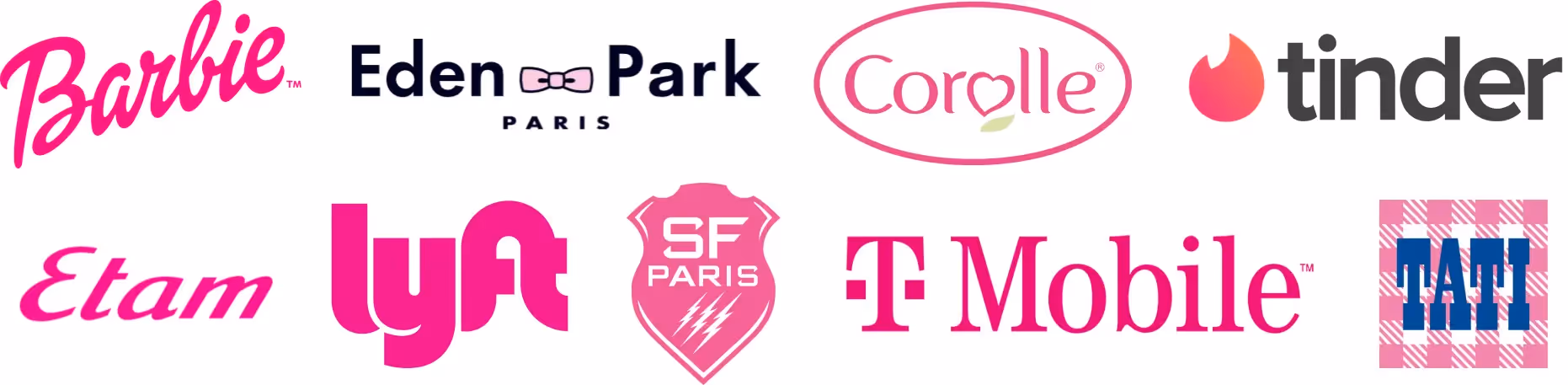
Few companies use pink as their primary color. Its historical association with femininity can be detrimental, as the color is often avoided for fear of perpetuating stereotypes.
Furthermore, pink is a cheerful color whose variations can be very vibrant or very dull. It can be difficult to find the perfect shade to stand out just enough.
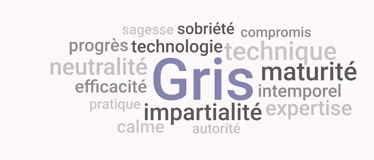
Grey is the second neutral color on this list. In this instance, grey evokes technicality, maturity, and wisdom. It is an understated and effective color.
This color is the top choice for companies in the automotive sector, which often want to be associated with elegance, modernity, and progress simultaneously.
For other brands, this color often serves as a secondary color. Indeed, it is a neutral color particularly popular for its minimalist and technical feel, refined.
.avif)
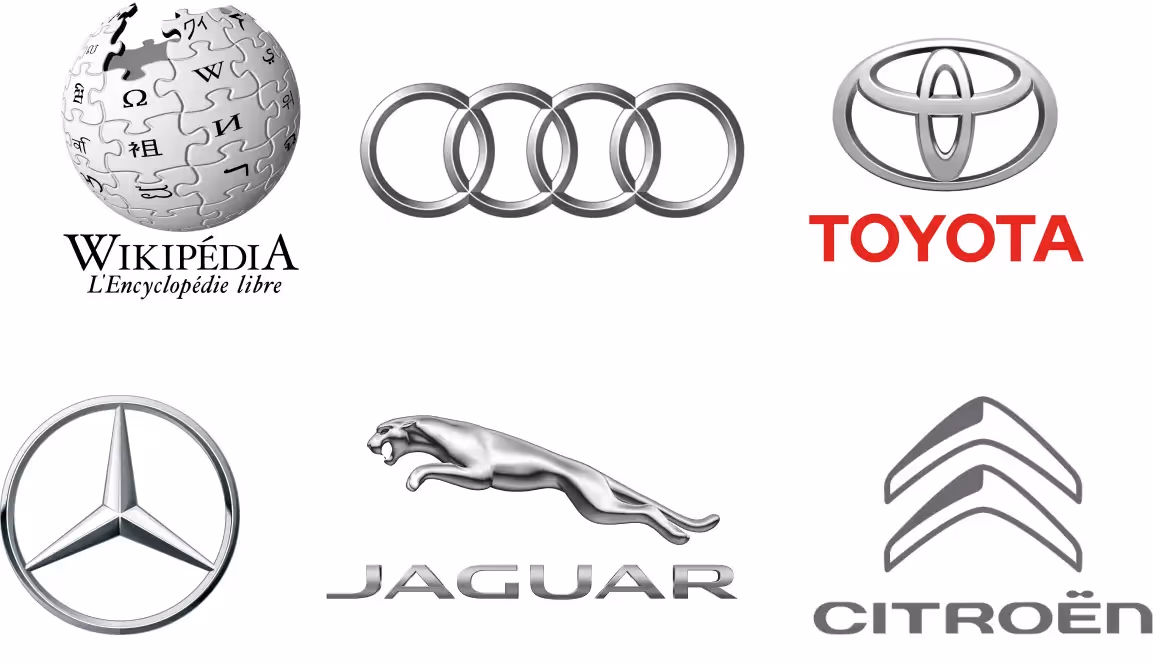
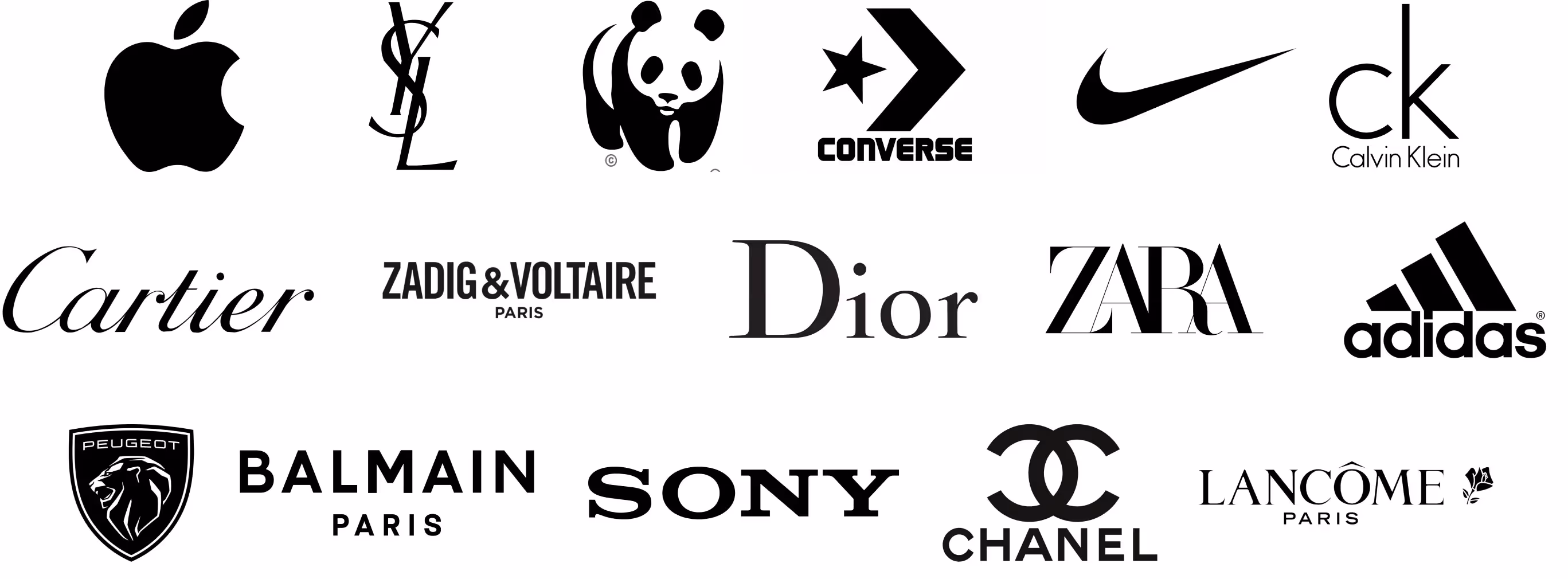
Black is by far the most used neutral color as a primary color.
Indeed, the black and white contrast is now associated with a blend of luxury and simplicity, between rigor and mystery.
Particularly popular among luxury brands, especially in ready-to-wear, black allows a brand to project a powerful, respectable, and profound image.
Many companies are also gradually migrating from their original color to black (Apple, Louis Vuitton, Peugeot, Lancôme…)
White is the last neutral color. White is inherently secondary, as it allows other colors to stand out.. Primarily associated with black, white nonetheless finds its place in a vast majority of logos.
The values generally associated with white are purity, cleanliness, peace, neutrality, impartiality, sophistication, efficiency, transparency, and luxury.

After white, however, we still need to discuss one last category of logo colors. A few rare companies decide to go beyond the 3 recommended colors.
These companies choose to have a logo composed of at least 4 colors. It then becomes very difficult to determine which of these colors is the main one… often, there isn't one.
Aside from companies whose business is directly related to color, this approach is generally adopted by companies with a very strong identity, pioneers or leaders in their sector.
These companies often offer a variety of complementary and distinct services, each of which can be associated with one color more than another.
III. How to combine colors in a logo?
You now know the ideas associated with each color.
To help you select or complement your company's primary color and thus your graphic charter, other colors may be necessary. You can complement it with other colors that have a strong identity or with neutral colors.
Here are the most frequently used types of color associations:
- Monochromatic : using several variations of a single color (shades)
- Analogous : using colors located side-by-side on the color wheel
- Complementary : using the opposite color on the color wheel
- Triadic : using three colors equally spaced on the color wheel
- Tetradic : using two complementary pairs of colors
To test the color complementarity of your chosen colors, we recommend using the website Adobe Colors and the website Coolors.

IV. Additional tips for optimizing your logo's colors
You have chosen your logo's primary color and complementary secondary colors. Remember to explore the different color shades and to use appropriate neutral colors. Below, you'll find essential information on this topic.
1. Using color variations to enhance your logo:
To find the color that best suits your needs, it's beneficial to explore color variations. For example, there are different types of blues, each conveying different messages. Here's a look at the main variations and their meaning.
- Pastel : this variation involves softening the intensity of the chosen color. This strengthens the trust, authenticity, and transparency your audience places in you. However, your image is less bold and impactful.
- Dark : this variation adds more strength, prestige, and seriousness to your brand image. Dark colors lend more authority and class to your company, though at the expense of dynamism and innovation.
- Light : lightening a color allows it to add lightness. This is particularly desirable for a secondary color to improve its contrast with a primary color and highlight it better.
- Bright : a bright color is more raw. Its dynamism, power, and boldness are enhanced. It signals creativity and will engage its audience more: people will be more attracted to it or, conversely, more repelled by it.
2. Using neutral colors in your logo:
As a reminder, some colors are categorized as neutral colors (white, grey, black, brown, and beige). These colors help add nuance and visual appeal to your logo without giving it overly strong signals.
3. What are the useful color formats for your brand guidelines and logo?
Colors are generally expressed as "RGB", for Red Green Blue. This allows for expressing the quantity of each of the 3 additive colors to achieve the desired hue.
CMYK (Cyan Magenta Yellow Black) is also frequently mentioned. These are the subtractive colors, used particularly by printers.
The HTML color format, often called the Web format, is expressed in "hexadecimal". It is the preferred format when you are working online and with digital partners. It is expressed by a sequence of 6 successive letters and/or numbers.
Finally, theThe Pantone color chart is often used by professional printers for printed materials. It then serves as a reference to ensure color consistency across all applications.
This is because, the display of the same color often varies depending on the display device : a modern television screen and a first-generation mobile phone do not have the same color palette and will not display two colors with the same level of precision.
4. What are the useful variations of a logo?
Finally, here are some useful logo variations to use in certain situations:
- Square or vertical logo : useful for social media
- Favicon : a square, contrasting logo with a background, typically displayed at the top of a webpage, for example
- Horizontal Logo : generally used on websites and communication materials
- Black Monochrome Logo : useful for printable documents and stamps, for example
- White Monochrome Logo : useful for integrating the logo into any colored or dark background
- Eco-Logo : a "hollow" version of a logo to limit ink usage
You now have all the information needed to choose the best colors for your logo. To complement this information, you can also consult our article which provides all the necessary information for creating a logo.
As design experts, you can also contact us to discuss your logo or brand identity project!

See also our other articles
Let's discuss your needs
Are you looking for a web agency for your project? Contact us and find out how we can help you.